How to Write a Homepage That Turns Visitors Into Customers
Your homepage has a few seconds to earn a visitor's trust. Here's how to write one that explains what you do and gently guides people to buy.
Most people leave a homepage in seconds. If your words don't quickly tell them what you offer and why it matters, they click away and never come back. The good news? You don't need to be a writer to fix this. This guide shows you how to write a homepage that turns visitors into customers, using plain words and a clear order.
Think of your homepage like a friendly shop assistant. When someone walks in, that assistant greets them, explains what's on offer, and points them toward the door labeled "buy." Your homepage should do the same thing with words.
Start with one clear sentence about what you do
The very first thing people read should answer a simple question: What is this, and who is it for? Don't be clever. Be clear.
Imagine you sell handmade candles. A weak headline says "Light up your world." A strong one says "Hand-poured soy candles that make your home smell amazing." The second one tells people exactly what they'll get.
Here's a simple way to build your headline:
- Say what you sell or do.
- Say who it helps.
- Say the good thing they get from it.
For example: "Simple bookkeeping for small shop owners who hate spreadsheets." In one line, the right person thinks, "That's me."
Follow the headline with a short, human sub-line
Right under your headline, add one or two short sentences that add a little more detail. This is where you explain the how or the why.
Sticking with the candles: "Made in small batches with clean-burning soy wax. Free shipping on orders over a set amount." Keep it warm and normal, like you're talking to one person, not a crowd.
Speak to the visitor, not about yourself
A common mistake is writing all about "we" and "our." "We are a passionate team." "We founded our company in a garage." People don't care about that yet. They care about their own problem.
So flip it. Use the word "you" more than "we." Instead of "We offer fast delivery," write "You'll get your order in two days." Same fact, but now it's about them.
Name the problem you solve
People buy things to fix something in their life. Maybe they're stressed, busy, bored, or stuck. When you say their problem out loud, they feel understood. And people buy from those who understand them.
Add a short section that describes the pain point in everyday words. If you're a freelance web designer, you might write: "Tired of a website that looks like everyone else's and never brings you clients? Let's fix that." That line does more work than a list of your skills.
Show what they get, not just what you offer
There's a difference between a feature and a benefit. A feature is a fact about your product. A benefit is what that fact does for the person.
Look at the difference:
| Feature (what it is) | Benefit (what they get) |
|---|---|
| 100% cotton t-shirts | Soft enough to wear all day, every day |
| 24-hour support | Get help the moment you're stuck, even at midnight |
| One-tap checkout | Buy in seconds without filling out long forms |
Always follow a feature with the benefit. The easy trick: after each feature, ask yourself "so what?" The answer is your benefit.
Add proof so people trust you
Strangers on the internet are careful with their money. You have to earn their trust fast. The best way is to let other people vouch for you.
Add a few of these to your homepage:
- Reviews or testimonials. Real quotes from happy customers. Use their first name if they're okay with it.
- Numbers. "Over 500 orders shipped" feels safer than saying nothing.
- Photos. Real product photos or a photo of you build trust more than stock images.
- Logos or mentions. If a known brand or paper mentioned you, show it.
Keep it honest. Never make up a review or a number. If you're brand new and have no reviews yet, offer your first product to a few people for feedback, then use their words.
Guide them to one clear action
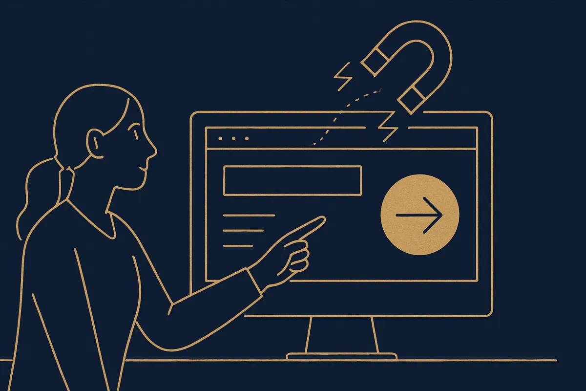
Every homepage needs a button that tells people what to do next. This is called a call to action, and it should be impossible to miss.
Don't crowd your page with ten different buttons. Pick the one thing you most want visitors to do, and make that button clear and simple: "Shop candles," "Book a free call," "Start your order." Put it near the top, and again lower down after you've explained the value.
Use action words that describe the result. "Get my plan" often beats a plain "Submit."
Put it in the right order
Here's a simple layout you can follow from top to bottom:
- Headline: what you do, in one line.
- Sub-line: a little more detail.
- Main button: the one action you want.
- The problem: what pain you solve.
- Benefits: what life looks like with your product.
- Proof: reviews, photos, numbers.
- Second button: repeat the call to action.
You don't need long paragraphs anywhere. Short lines are easier to read on a phone, and most people will visit on a phone.
A quick before-and-after example
Say you're a home baker. Here's a weak homepage opening:
"Welcome to our website! We are passionate about baking and hope you enjoy browsing our selection of goods."
Now here's a stronger version:
"Fresh cakes baked to order for birthdays and parties near you. Tell us the date, and we'll handle the sweet part. Order your cake."
The second one is shorter, but it says what you get, who it's for, and what to do next. That's the whole job.
Test, then improve
Your first version won't be perfect, and that's fine. Publish it, then watch. Read your homepage out loud. If a sentence feels stiff, rewrite it the way you'd actually say it to a friend.
Ask one or two people who don't know your business to read it. Then ask: "What do you think I sell, and who is it for?" If they can't answer in a few seconds, your headline needs work. Small changes to your words often bring more sales than a whole new design.
If building the page itself feels like the hard part, a website builder like vq.pe lets you drop in these sections, add a buy button, and take payments without touching any code, so you can spend your time on the words that matter.
You don't need fancy language to sell. You need clear words, in the right order, that speak to one real person. Write your headline today, add your proof, point people to one button, and let your homepage do the quiet work of turning visitors into customers.