
How to Create a Store Search Bar That Helps Shoppers Find Products Fast

A good search bar turns confused visitors into buyers. Learn how to set one up so shoppers find the right product in seconds and check out faster.
When someone lands on your store already knowing what they want, the search bar is often the first thing they look for. If it works well, they find the product in seconds and buy. If it's slow, hidden, or gives useless results, they leave. A good store search bar is one of the cheapest ways to turn browsers into buyers, and this guide shows you how to set one up the right way.
You don't need to be technical. You just need to understand what shoppers expect and make small, smart choices. Let's walk through it.
Why your search bar matters more than you think
People who use search are your most valuable visitors. They aren't just looking around. They have a product in mind and they want it now. Studies across ecommerce keep showing the same thing: searchers buy more often than people who only click through menus.
So if your search is weak, you're losing your warmest customers. And here's the tricky part. A bad search doesn't send you an error message. The shopper just quietly gives up and closes the tab. You never even know it happened.
The good news? Fixing search is mostly about a few clear decisions, not complicated code.
Where to put the search bar so people find it
Shoppers expect the search bar in a few specific spots. Put it anywhere else and they'll assume you don't have one.
- Top of every page. Place it in the header so it's always there, no matter where someone is browsing.
- Centered or to the right. Most people scan the top of a page from the middle to the right. That's where their eyes look for search.
- Visible, not hidden behind an icon. On desktop, show the full open box, not just a tiny magnifying glass. Every hidden step loses a few people.
- Easy to reach on mobile. On phones an icon is fine because space is tight, but make it big enough to tap and put it at the top.
A simple rule: if a first-time visitor can't find your search in under two seconds, it's in the wrong place.
Make the search box itself inviting
Small details change how often people use search. Give the box some breathing room so it looks clickable. Add a short hint inside it, like "Search shoes, bags, gifts..." so shoppers know what they can look for. That little nudge helps people who aren't sure how to start.
Keep the box wide enough to show a full search phrase. A box that only fits one word feels cramped and makes people doubt it works. And make sure hitting the Enter key runs the search. It sounds obvious, but a surprising number of stores break this.
Show suggestions as people type
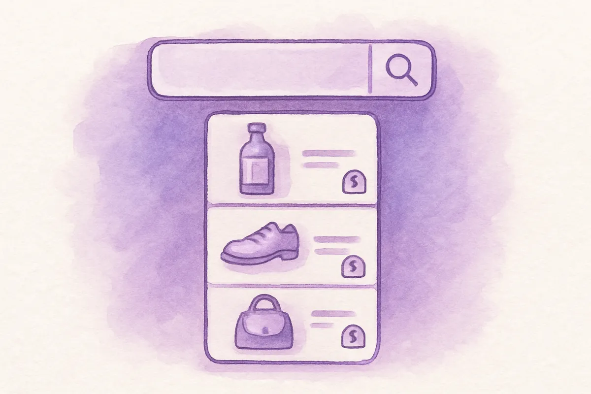
This is the feature that makes search feel fast and smart. As soon as someone starts typing, show matching products in a small dropdown. This is called autocomplete or live search.
Good suggestions do three things:
- Show the product name so people recognize what they want.
- Show a small product image, because shoppers scan pictures faster than words.
- Show the price, so they can decide right away.
Even showing three or four results while someone types can save them a full page load. It feels effortless, and effortless shopping means more sales.
Handle spelling mistakes and different words
Real people type fast and make mistakes. They write "sneakrs" instead of "sneakers" or search "jumper" when your product is listed as "sweater." If your search only matches exact words, all these shoppers hit a dead end.
Set your search up to be forgiving. Look for a search tool that:
- Fixes small typos automatically.
- Understands close words and plurals, like "shoe" and "shoes."
- Matches partial words, so "blue dr" still finds "blue dress."
If your platform lets you add keyword tags to products, use them. Add the everyday words your customers actually say, not just the official product name. Think about slang, common nicknames, and other regions' terms. If you sell to different countries, this matters even more, and it pairs well with how you localize your website for different countries.
Add filters so big stores stay easy
Search gets people close. Filters get them the exact item. Once a search returns lots of results, shoppers need a quick way to narrow down. Let them filter by things that matter for your products, such as:
- Price range
- Size or color
- Category or type
- In stock only
Also let people sort results, like cheapest first or newest first. If you sell dozens of items or more, this is the difference between a shopper who buys and one who feels overwhelmed. The same thinking goes into how you design a product category page that sells faster, so keep the two consistent.

Never show a blank "no results" page
An empty results page is a lost sale. When search finds nothing, don't just say "nothing found" and stop. Give people somewhere to go instead.
Here's what a helpful empty result should do:
- Say clearly that nothing matched, in a friendly way.
- Suggest checking the spelling.
- Show your most popular products or a few bestsellers.
- Offer a link to browse all products or main categories.
This keeps the shopper moving instead of leaving. A dead end costs you money. A gentle detour keeps the visit alive.
A quick real-world example
Say you run a small kitchen store. A customer searches "non stick pan." With a basic search, they might get nothing because your product is titled "Ceramic Coated Frying Pan." That's a lost sale from someone who was ready to buy.
Now imagine a better setup. You added "non stick" as a keyword tag on that product. The moment they type "non st," the pan pops up with its photo and price. They click, they see it's in stock, they buy. Same product, same shopper, completely different outcome. That's the power of a few small tweaks.
Steps to set up your search bar today
Here's a simple order to work through so nothing gets missed.
- Place the box in your header so it shows on every page, on both desktop and mobile.
- Turn on live suggestions with product images and prices if your platform supports it.
- Add keyword tags to your products using the everyday words customers actually search.
- Enable typo tolerance so small spelling mistakes still return results.
- Add filters and sorting for stores with many products.
- Design a helpful empty page that suggests popular items instead of a dead end.
- Test it yourself. Search like a real, careless customer would. Try wrong spellings, half words, and slang.
Most modern store builders include search you can switch on without touching any code. With a platform like vq.pe, the search bar, product tags, and store pages live in one place, so you can set this up and adjust it as you learn what people look for.
Learn from what people search for
Your search bar is also a free window into your customers' minds. Every search is someone telling you exactly what they want. Check which terms people type most often, and which ones return no results.
If lots of people search for something you don't sell, that's a hint to stock it. If people search for a product you do have but get nothing, your tags or titles need fixing. This is one of the clearest signals in your data, and it fits neatly into the habit of learning to read your store analytics to find what loses sales.
A search bar might feel like a small detail, but it quietly guides your best customers straight to checkout. Start with placement and live suggestions, add tags and filters, and never leave a shopper at a dead end. Set it up today, then check your search terms in a week and keep improving from there.