
How to Design a Product Category Page That Sells Faster
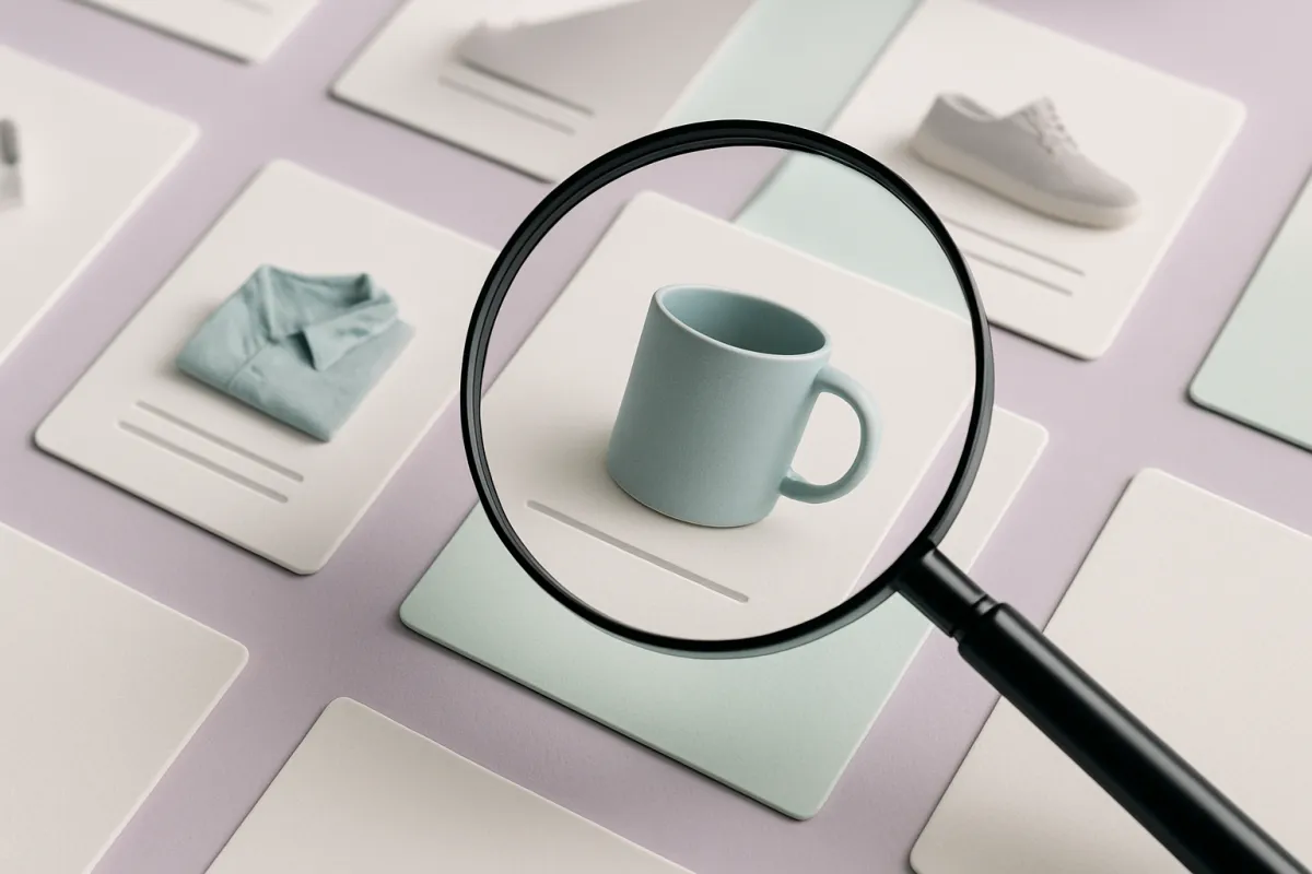
A good product category page helps shoppers find and buy in seconds. Learn how to lay it out, what to put on each product card, and the filters that actually help.
A product category page is the page that shows a group of items together, like "T-shirts" or "Coffee Mugs" or "Digital Templates." It is one of the busiest pages in any online store, because most shoppers land here before they ever open a single product. If this page is confusing or slow, people leave. If it is clear and easy to scan, they find what they want and buy faster. This guide shows you how to build one that does the second thing.
You do not need design skills. You just need to make good choices about layout, what to show on each item, and how people search inside the page. Let us go step by step.
What a product category page is really for
Think of this page like a shelf in a shop. The shopper is standing in front of it, scanning. They are asking three quiet questions: "Do you have what I want? Is it any good? How much is it?" Your job is to answer all three in a few seconds, without making them click around.
So the page has one main goal: help someone go from "browsing" to "I want that one" as quickly as possible. Everything you add should serve that goal. Everything that gets in the way should go.
Start with a clear, simple top section
The top of the page sets the tone. Keep it light. You want a short title that names the category in plain words, and maybe one line saying what is inside. That is it. Do not fill the top with a giant banner image that pushes all the products off the screen.
Here is a simple order that works well:
- The category name, big and clear.
- One short sentence of context if it helps (for example, "Handmade, ships in 2 days").
- The products, starting as high up as possible.
The faster a shopper sees actual products, the better. If they have to scroll past a long block of text or a huge photo to reach the goods, many will give up. Show the shelf, not the poster.
Design product cards that answer quick questions
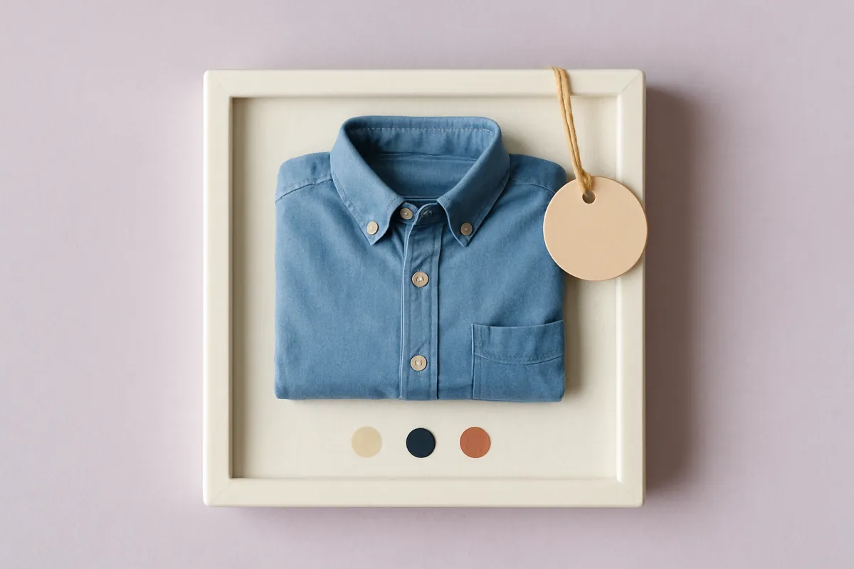
Each item on the page sits inside a small box called a product card. This card is doing a lot of work in a tiny space. A weak card makes people click into every product to learn basic things. A strong card answers the common questions right there, so shoppers can compare fast.
A good product card usually shows:
- A clear photo on a clean background, all the same size and shape as the others.
- The product name in plain words, not clever names only you understand.
- The price, easy to see. If there is a discount, show the old and new price.
- One small detail that helps, like a color dot, a rating, or a "Low stock" note.
Keep the cards consistent. Same photo style, same spacing, same button. When cards look the same, the eye moves smoothly down the page. When every card is a different height or style, scanning feels tiring and slow.
If you sell items that come in different options, like sizes or colors, showing a few small color swatches on the card is a nice touch. It tells shoppers "yes, this comes in blue" before they even click. Setting this up cleanly is easier when you have already sorted out your product variants for size, color, and style.
Add filters and sorting that actually help
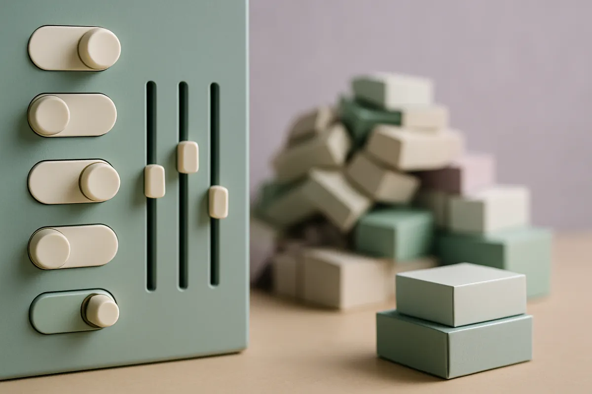
Once you have more than about a dozen products, people need a way to narrow things down. This is where filters come in. A filter lets a shopper say "only show me size medium" or "only show me items under a certain price." Sorting lets them reorder the list, like "cheapest first" or "newest first."
The trick is to only offer filters that match how people actually shop. If you sell shoes, size and color matter a lot. If you sell one-size digital files, a size filter is pointless clutter. Watch what your buyers ask about, and turn those questions into filters.
A few simple rules:
- Put the most-used filters first (usually price, size, and color).
- Show how many items match after a filter is applied, so people know it worked.
- Make it easy to clear filters and start over.
- On phones, keep filters behind a single button so they do not eat the screen.
Do not overdo it. Ten confusing filters are worse than three useful ones. Start small and add more only when you see people struggling to find things.
Guide the eye with smart order and grouping
The order of products is not random, or it should not be. What you place first gets seen most. So put your strongest items near the top: your best sellers, your newest arrivals, or the things with the best margins. Bury the slow movers lower down.
You can also group items in helpful ways. For a clothing category, you might show "New in" first, then the rest. For a food shop, you might group by type. Grouping gives the page a sense of order, like tidy shelves instead of a pile.
One more thing: keep an eye on what people click and buy. Your store's own numbers will tell you which products earn attention and which get ignored. Learning to read your store analytics to find what loses sales helps you decide what to move up, what to fix, and what to drop.
Speed and mobile matter more than you think
Most people will open your store on a phone. So the page has to look good and load fast on a small screen. If images are huge files, the page crawls, and shoppers leave before it even finishes. Use images that are sized for the web, not straight off your camera.
On mobile, aim for two product cards side by side, big enough to tap easily. Make sure buttons are not so small that people miss them. Test it yourself: open the page on your own phone and try to buy something. If anything annoys you, it will annoy your customers too.
Speed also means fewer surprises. Do not make people wait for pop-ups or slow animations. Every extra second and every extra distraction costs you sales.
Small touches that reduce doubt
Sometimes a shopper likes a product but hesitates. A few quiet signals on or near the card can settle their mind. Star ratings show that others bought and liked it. A "only 3 left" note adds gentle urgency, but only use it when it is true. Clear delivery info near the products tells people they will get their order in time.
If shoppers keep asking the same things before buying, answer those questions right where they browse. A short, honest product FAQ that removes buying doubts can turn a maybe into a yes without any extra effort from you.
A quick checklist before you publish
Before you call the page done, walk through it like a first-time visitor and check these:
- Can I see real products within one scroll on my phone?
- Does each card show a photo, name, and price at a glance?
- Are the cards all the same size and style?
- Do the filters match how people actually shop here?
- Are my best items near the top?
- Does the page load quickly, with no clutter blocking the goods?
- Is the button to view or add each item easy to tap?
If you can say yes to all of those, you have a category page that respects the shopper's time and helps them buy.
You do not have to build all this by hand. A website builder like vq.pe gives you category pages, product cards, filters, and checkout that already work together on phones and computers, so you can focus on your products instead of the plumbing.
Start with one category page. Lay out the cards, add two or three useful filters, and put your best items on top. Then watch how people move through it and tweak from there. Small, clear improvements add up to a store that sells faster.