
How to Design a High-Converting Single Product Landing Page
A single product landing page has one job: turn a visitor into a buyer. Here is how to design one that actually gets people to click buy.
You have one product. You want people to buy it. A single product landing page is the simplest way to make that happen, because the whole page points at one goal: get the visitor to click buy. No menus pulling them away, no other products to compare, just one clear offer. In this guide you will learn how to design a high-converting landing page for a single product, section by section, in plain language.
Think of the page like a good salesperson. It grabs attention, explains why the product helps, answers worries, shows proof, and then asks for the sale at the right moment. Let's build it in that order.
Start with one clear goal
Before you touch the design, decide the single action you want. For most products that is "buy now." For a higher-priced item it might be "add to cart" or "book a call." Whatever it is, everything on the page should push toward that one thing.
Here is a simple rule: if a section does not help the visitor decide to buy, cut it. A single product page wins because it removes distractions. Keep it focused.
The first screen has to do the heavy lifting
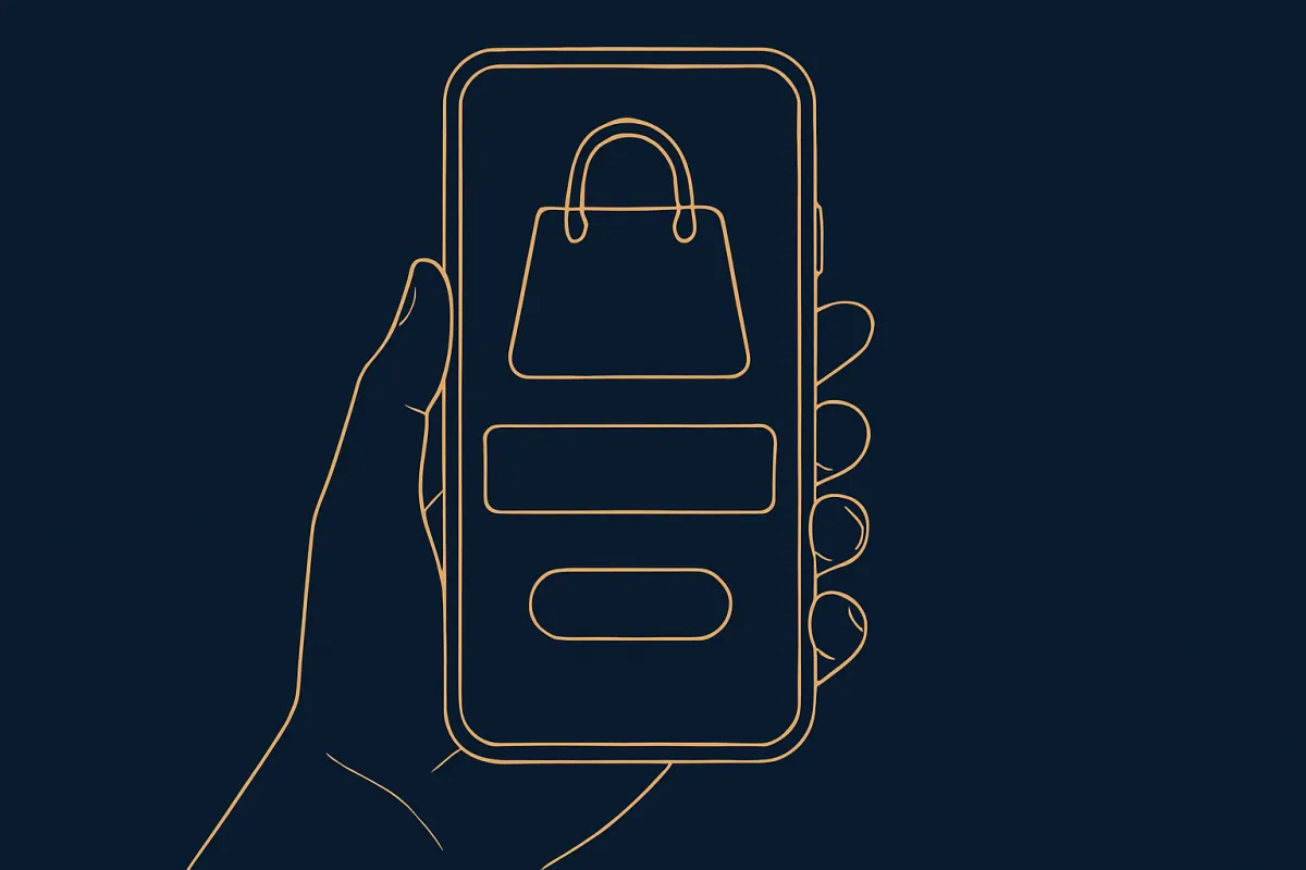
Most people decide in a few seconds whether to keep reading. The part they see before scrolling, often called the hero, needs four things:
- A clear headline that says what the product is and what it does for them.
- A short line underneath that adds the key benefit or removes a doubt.
- A strong product image so they instantly see what they are getting.
- One button with an action word like "Buy now" or "Get yours."
Write the headline for the reader, not for you. "Sleep better in seven nights" beats "Premium weighted blanket." One talks about their life. The other talks about the product. If you struggle with the words, our guide on how to write website copy that sounds human and sells walks through this in more detail.
Show the product like a shop window
People cannot touch your product online, so your images have to do the work. Use a few clean photos from different angles. Show it in use, in someone's hands or home, so they can picture owning it. If it is a digital product, show screenshots or a short preview.
A quick tip: your main image should look good even as a small thumbnail, because many visitors are on their phones. Test how the page looks on a small screen before anything else.
Turn features into plain benefits
A feature is what the product has. A benefit is what that means for the buyer. People buy benefits. So next to each feature, tell them why it matters.
- "Waterproof material" becomes "Use it in the rain without worry."
- "Lasts 12 hours" becomes "Charge it once, forget about it all day."
- "100% cotton" becomes "Soft on skin, no itching."
Keep these short and scannable. Three to five strong benefits beat a long list nobody reads. Use small headings, short lines, and maybe a simple icon for each. Let the page breathe.
Answer the worries before they leave
Every buyer has quiet doubts. Will it fit? Is it worth the money? What if I don't like it? A high-converting page answers these right on the page, so the visitor never has to leave to find out.
Common worries to cover:
- Will it work for me? Explain who it is for and who it is not for.
- What if it goes wrong? Mention your return or refund terms plainly.
- How and when do I get it? Give a clear delivery timeframe. A short, honest shipping policy that sets clear expectations removes a lot of hesitation.
- Is this real? This is where proof comes in, which we cover next.
A short FAQ near the bottom handles the smaller questions and cuts down on messages you have to answer one by one. Here is how to add a FAQ that answers buyer questions.
Add proof that real people trust it
Nothing convinces like other buyers. Reviews, star ratings, photos from customers, and short quotes all tell a nervous visitor "other people bought this and were happy." Put at least a few of these on the page.
Real beats polished. A plain review with a first name and a real photo feels more honest than a perfect glossy quote. If you are just starting and have no reviews yet, ask your first few buyers directly. Our guide on how to collect and display customer reviews that win buyers shows the easy way to gather them.
Make the price and offer easy to understand
Show the price clearly. Do not hide it or make people click around to find it. If there is a discount, show the old price next to the new one so the saving is obvious. If you offer a bundle or free shipping over a certain amount, say so plainly.
One thing that helps: place a buy button near the top and again near the bottom. Some people are ready after the hero. Others need to read everything first. Give both types a button right where they decide.
Keep the checkout short and painless
You can do everything right and still lose the sale at checkout. Long forms, surprise fees, and too few payment options kill conversions. Ask only for what you truly need. Show shipping costs early, not as a shock at the end.
Offer the payment methods your buyers actually use, whether that is cards, UPI, wallets, or cash on delivery. If your customers are local, letting them pay how they prefer matters a lot. You can see how to set up checkout for UPI, cards, wallets, and COD to cover more buyers.
If wiring all of this together sounds like a lot, a builder like vq.pe lets you put the page, the buy button, and the payment options in one place, so a visitor can go from reading to paying in a tap.
A quick example
Say you sell one handmade candle. Your page opens with a warm photo and the headline "Fill your home with calm." Below it, a line: "Hand-poured soy candle, 40 hours of soft scent." One button: "Order yours." Then three benefits, a few photos in a cozy room, four real reviews with names, a short FAQ about scent and burn time, the price with free delivery over a set amount, and a final buy button. Nothing extra. That is a page built to sell one thing well.
Test one change at a time
Your first version will not be perfect, and that is fine. Launch it, watch how people behave, and improve slowly. Change your headline, or move the button, or swap the main photo, but change only one thing at a time so you know what made the difference.
Pay attention to where people drop off. If lots of visitors reach checkout but do not finish, the problem is likely there, not in your copy. Reading your numbers the right way helps you fix the real leak instead of guessing. The habit of reading your store analytics to find what loses sales turns a good page into a great one over time. If you want a fuller layout guide, see how to build a one-page website that converts.
You do not need a big design budget or fancy tools. You need one clear offer, honest words, real proof, and an easy checkout. Start with a simple version today, put it in front of real people, and refine it from there. Your best landing page is the one that is live and learning.