
How to Structure a Pricing Page That Makes People Choose
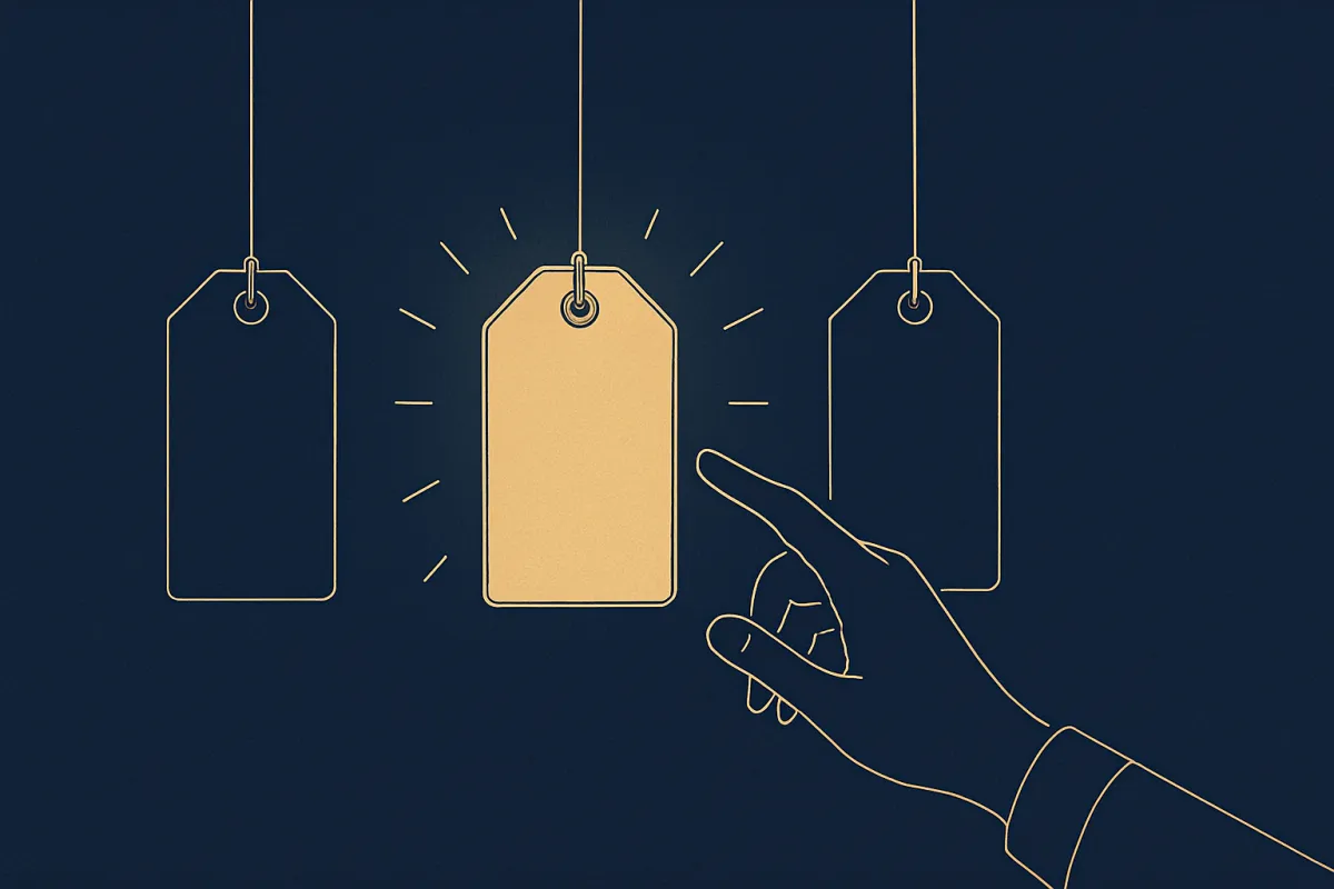
A confused visitor never buys. Here's how to structure a pricing page that makes the choice feel easy, so more people pick a plan and check out.
Your pricing page is where people decide to pay you or leave. It is one of the most visited pages on any site that sells something, yet it is often the messiest. Too many options, unclear plans, hidden costs, and the visitor quietly closes the tab. The good news: a clear structure fixes most of this. In this guide you'll learn how to build a pricing page that makes the choice feel simple, so more people say yes.
Why most pricing pages lose sales
People do not leave a pricing page because your product is bad. They leave because they feel unsure. When someone lands on your page, their brain is quietly asking three questions: What do I get? How much is it? Which one should I pick? If any of those feel foggy, they stall. And a stalled visitor almost always leaves.
The mistake most people make is thinking more choices help. They don't. Five plans with tiny differences make the reader work harder, and a tired reader buys nothing. Your job is not to show everything you offer. Your job is to guide one person to the right choice, fast.
Start with the number of plans you actually need
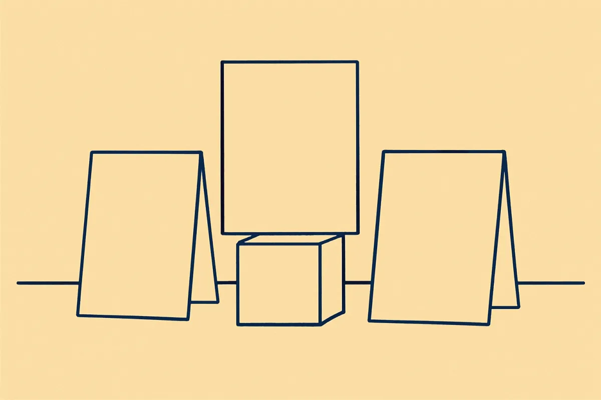
Most small businesses do best with two or three plans. That's it. Two feels clean. Three lets you gently steer people toward the middle option, which is what many buyers pick by default.
Here is a simple way to think about three tiers:
- The starter plan - for someone testing you out or on a tight budget.
- The main plan - the one you actually want most people to buy. Make it the best value.
- The premium plan - for serious buyers who want more. This also makes the main plan look reasonable by comparison.
That premium plan does quiet work even when few people buy it. Next to something expensive, your middle plan suddenly feels like a smart, safe pick.
Give each plan a clear name and a one-line promise
Don't just label your plans "Plan A" or "Basic, Pro, Ultra" and stop there. Under each name, add one short line that says who it's for. Something like "For your first store" or "For growing shops." This helps a visitor spot their own situation in seconds and think, "That one is me."
When people see themselves in a plan, they stop comparing every tiny feature and start leaning toward a decision. That's exactly what you want.
Show the price the way people expect
Put the price big, clear, and right up top for each plan. No hunting. If there are extra costs, taxes, or fees, say so plainly near the price. Nothing kills trust faster than a surprise charge at checkout, and surprises are one of the biggest reasons shoppers abandon their carts. If you sell products rather than plans, it helps to first nail down the actual numbers using a method for pricing your products with no guessing.
A few small touches make prices feel easier to accept:
- Show monthly and yearly options if you offer both, and point out the yearly saving.
- If a plan is a one-time payment, say "pay once" clearly so people don't fear a subscription.
- Use a plain currency amount, not a range. Ranges create doubt.
List features as benefits, not a spec sheet
A long list of features written in your own internal language means nothing to a first-time visitor. Instead of "Advanced analytics module," write "See exactly which products sell best." Instead of "Multi-gateway support," write "Accept cards, UPI, wallets, and cash on delivery."
Keep each plan's feature list short and scannable. Five to seven lines per plan is plenty. If your higher plan includes everything from the lower one, say "Everything in Starter, plus..." so people don't have to reread the same points twice.
Write these lines the way you'd explain them to a friend. If a sentence sounds stiff, rewrite it. The same rule that makes good website copy sound human and sell applies here too.
Highlight the plan you want people to choose
Give your main plan a little visual push. A label like "Most popular" or "Best value," a slightly bigger box, or a highlighted button all work. This isn't a trick. Most people genuinely want to be told what the sensible choice is, and a gentle nudge saves them from decision fatigue.
Just don't overdo it. One highlighted plan is guidance. Three highlighted plans is noise, and noise makes people freeze.
Make the buy button obvious and specific
Every plan needs its own clear button. Don't make people scroll to find one shared button at the bottom. And skip the vague "Submit." Use words that match the action, like "Start now," "Get this plan," or "Buy today."
The path from button to payment should be short. The fewer steps between clicking and paying, the more sales you keep. If you want to dig into this, our guide on how to reduce cart abandonment in your online store covers the small friction points that quietly lose buyers.
Answer the doubts right on the page
People hesitate for predictable reasons. What if it's not right for me? Can I cancel? Is my payment safe? Do I get a refund? Answer these near the pricing, not buried on some other page.
A short line under each button helps a lot. Things like "Cancel anytime," "7-day refund," or "No card needed to start" remove fear in the exact moment someone is deciding. A short FAQ block below the plans handles the rest.
A simple structure you can copy
Here's a layout that works for most pricing pages, top to bottom:
- A short headline that says what you help people do.
- Your two or three plans side by side, each with a name, a one-line "who it's for," a clear price, and a short benefit list.
- One plan gently highlighted as the recommended choice.
- A clear buy button on each plan, with a reassurance line underneath.
- A short FAQ answering the common doubts.
- A little proof, like a customer review or a count of happy buyers.
Add proof so people feel safe paying
Nobody wants to be the first to trust you. A couple of short, real customer reviews near your plans do more than any clever wording. Even one honest quote from a happy buyer eases doubt. Learning how to collect and display customer reviews that win buyers is worth the effort here, because a pricing page is exactly where that trust pays off.
A quick before-and-after example
Imagine Priya sells a meal-planning template. Her first pricing page had four plans, feature names only she understood, and one button at the bottom. Visitors scrolled, got confused, and left.
She rebuilt it with three plans. The middle one was labeled "Most popular" and had a line that read "For busy families." Each feature became a plain benefit. Every plan got its own "Get this plan" button with "Instant download" underneath. She added two short reviews. Same product, same prices, but far clearer. More people chose, because choosing finally felt easy.
That's the whole point. You are not trying to convince people harder. You are removing the confusion that was stopping them.
Test one thing at a time
Once your page is live, resist the urge to redo everything at once. Change one element, watch what happens, then change the next. Try a different label on your main plan. Try adding a reassurance line. Try swapping feature wording. Small, patient changes tell you what your specific buyers respond to.
If setting up plans, buttons, and checkout by hand feels like a lot, a builder like vq.pe lets you lay out pricing sections, add buy buttons, and connect payments without touching code, so you can focus on the words and the choice instead of the wiring.
Start simple. Pick your two or three plans, write one honest line for each, make the buttons clear, and answer the obvious doubts. A pricing page that respects your visitor's time is a pricing page that gets chosen. Build that version today, then improve it one small step at a time.