
How to Design a Mobile-First Website for Every Phone

Most of your visitors are on a phone. Here's how to design a mobile-first website that loads fast, reads easy, and looks great on every screen.
Open your website on your phone right now. Are the buttons easy to tap? Does the text fit without pinching and zooming? For most sites today, more than half of visitors show up on a phone, not a computer. So if your site only looks good on a big screen, you are losing people. A mobile-first website flips the usual order: you design for the small screen first, then make it bigger. This guide shows you how, step by step, in plain language.
What "mobile-first" really means
Mobile-first is a way of thinking, not a special tool. Instead of building a website for a laptop and then squishing it to fit a phone, you start with the phone. You decide what matters most on a tiny screen. Then, as the screen gets wider, you add more room and detail.
Why start small? Because the phone forces you to be honest. There is very little space. You can only keep what truly matters. When you get the phone version right, the desktop version almost always looks clean too. It rarely works the other way around.
Start with one clear job per page
Before you touch any design, ask a simple question about each page: what do I want the visitor to do here? Maybe it is buy a product. Maybe it is book a call. Maybe it is join your email list. Pick one main action. That action becomes the star of your phone screen.
On a small screen you cannot show everything at once. So put the most important thing first, right where the thumb lands. Everything else can wait further down the page.
- Homepage: a short headline, one line about what you offer, one clear button.
- Product page: photo, price, and a buy button that a thumb can reach.
- Contact page: a short form or a tap-to-call button, nothing extra.
Design for the thumb, not the mouse
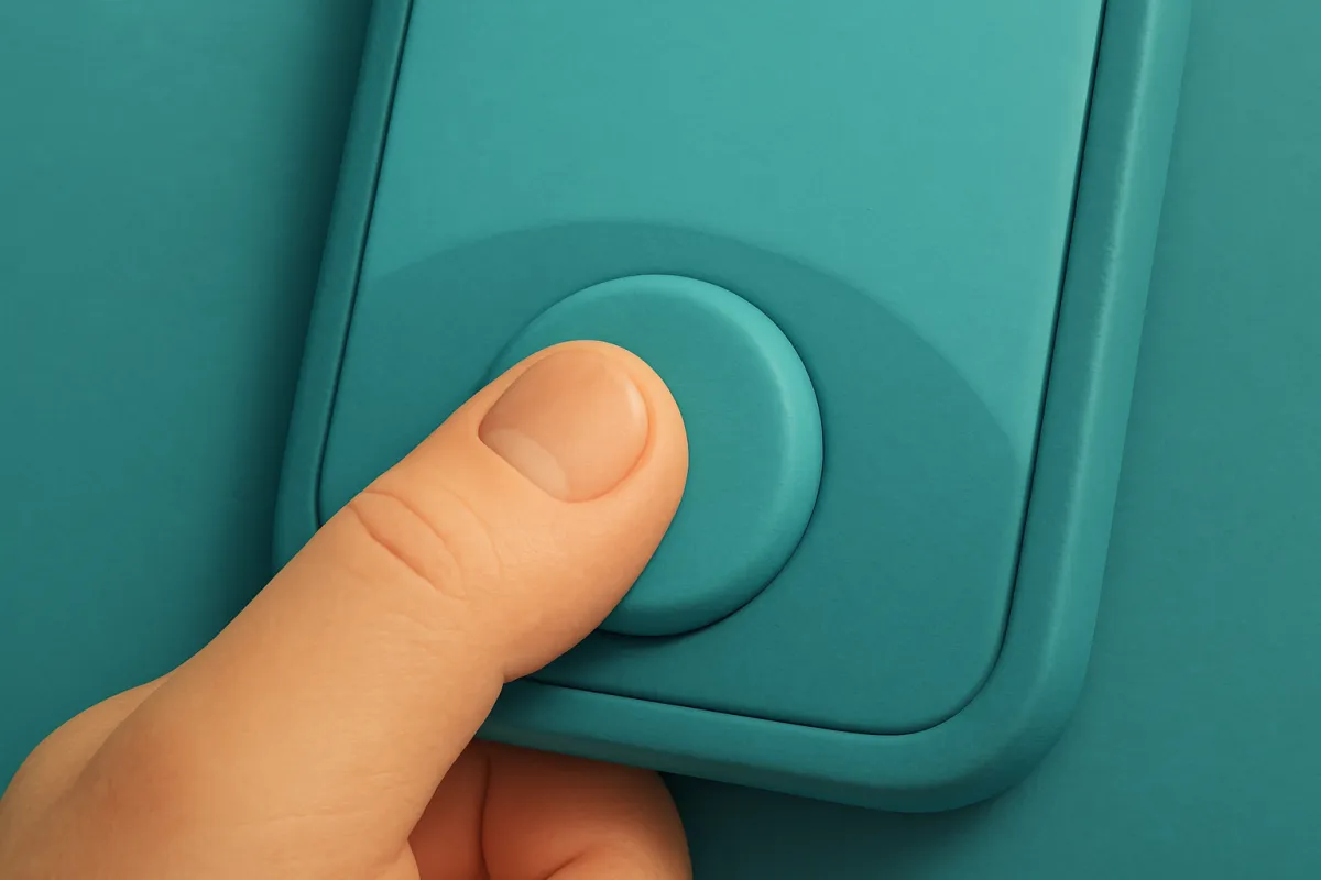
On a computer people click with a tiny, exact cursor. On a phone they tap with a fat thumb. That changes everything. Small links sit too close together. Tiny buttons get missed. People get frustrated and leave.
Here are the basics that keep tapping easy:
- Make buttons big. A good tap target is roughly the size of a fingertip. If you have to aim carefully, it is too small.
- Add space between links. Give each tappable thing room to breathe so people do not hit the wrong one.
- Keep key buttons within thumb reach. Most people hold a phone in one hand. The easiest spot to tap is the lower half of the screen.
- Use one column. Phones are tall and narrow. Stack things top to bottom instead of side by side.
Make text easy to read on a small screen
Tiny text is the fastest way to lose a phone visitor. If someone has to zoom in to read a sentence, they are already half gone. Keep your body text comfortably large, so a person can read it at arm's length without squinting.
A few simple rules help a lot:
- Use short paragraphs. Two or three sentences each. Walls of text feel heavy on a phone.
- Keep lines from stretching too wide. Narrow lines are easier to follow.
- Pick a plain, clear font. Fancy fonts look nice but tire the eyes.
- Use strong contrast. Dark text on a light background (or the reverse) is easiest to read outdoors.

Speed matters more on a phone
People on phones are often on the move, sometimes on slow connections. If your page takes too long to load, they leave before they see anything. Speed is part of design, even though you cannot "see" it.
The biggest slowdown is usually images. A giant photo meant for a wide screen is far too heavy for a phone. Shrink and compress your images so they load fast. While you are at it, add clear alt text to your images so screen readers and search engines understand them too.
Other quick wins for speed:
- Use only the fonts and effects you truly need.
- Avoid huge background videos on phones.
- Let images load as the visitor scrolls, not all at once.
Test on a real phone, not just a preview
A preview on your computer is helpful, but it is not the real thing. Fingers, glare, and slow signal all change the experience. So pick up an actual phone and use your site like a stranger would.
Walk through the whole path. Land on the homepage. Tap to a product or service. Fill in the form or start checkout. If anything feels awkward, fix it. Better yet, hand your phone to a friend and stay quiet while they try. You will learn a lot in two minutes.
If your friend has to ask "where do I tap?", the design is not done yet.
Try it on more than one phone if you can. A small older phone and a big new one behave differently. What fits on one may spill over on another.
Common mobile mistakes to avoid
Some small things quietly ruin the phone experience. Watch out for these:
- Pop-ups that cover the whole screen. They are annoying anywhere, but on a phone the tiny close button is often impossible to find.
- Menus with too many items. Keep your navigation short. A simple tap-to-open menu with a handful of links beats a crowded bar.
- Forms that ask for too much. Every extra field costs you people. Ask only for what you truly need.
- Text next to images that gets cut off. On a phone these should stack, not sit side by side.
- Tiny "X" buttons and links in corners. Thumbs cannot reach corners easily.
Let your site work like an app
Once your site feels good on a phone, you can take it one step further. You can turn it into something people install on their home screen, so it opens fast and full-screen like a real app. This is a simple way to keep loyal visitors coming back, and you can read more about how to turn your store into an installable app when you are ready.
If you run a shop, mobile-first thinking pays off at checkout most of all. A clear buy button, a short form, and a fast page can be the difference between a sale and a bounce. Small touches like trust signals near your checkout also help nervous first-time buyers feel safe enough to pay.
An easier way to get it right
Doing all of this by hand takes real coding skill. The good news is you do not have to. A modern website builder like vq.pe uses themes that already adjust to every screen size, so your pages look tidy on a phone without you writing a single line of code. You drag, drop, preview on mobile, and publish.
That means you can spend your time on the parts that actually matter: your message, your photos, and your offer. The layout adapts on its own.
Your quick mobile-first checklist
Before you hit publish, run through this list on your phone:
- Is the main action visible without scrolling?
- Are buttons big and easy to tap with a thumb?
- Can you read the text without zooming?
- Does the page load quickly on mobile data?
- Does everything stack neatly in one column?
- Did a real person test it on a real phone?
Getting a website to look great on every phone is not about fancy tricks. It is about respecting the small screen and the person holding it. Start with the phone, keep it simple, make things easy to tap and read, and test on a real device. Do that, and your site will feel good in almost anyone's hand. Open your builder, switch to the mobile view, and start there today.