
How to Structure Your Website Navigation Menu the Right Way
A confusing menu sends visitors away. Learn how to structure your website navigation menu so people find what they need in seconds and stick around to buy.
Your navigation menu is the little bar of links at the top of your website. It is also the first thing most visitors use to find their way around. If it is clear, people relax and explore. If it is messy or confusing, they leave, often in just a few seconds. This guide shows you how to structure your website navigation menu so visitors find what they need without thinking hard about it.
The good news? You do not need design skills or code. You just need a simple plan and a few rules of thumb. Let's walk through them.
Why your navigation menu matters more than you think
Think of your website like a shop. The menu is the signage that tells people where to go. When someone lands on your site, they usually have one question in mind: "Can this place help me?" A clear menu answers that fast.
A cluttered menu does the opposite. When people see fifteen links crammed into a row, they feel lost. And a confused visitor rarely becomes a customer. So the goal is simple: make it easy for people to guess where things are and get there in one click.
Start by listing what visitors actually want
Before you touch the menu, grab a piece of paper. Write down the main reasons people come to your site. Not what you want to show them, but what they are looking for.
For a small shop, that might be:
- See the products
- Find out about shipping and returns
- Contact you with a question
- Learn a bit about who you are
For a freelancer, it might be work samples, services, prices, and a way to get in touch. Once you have this list, your menu almost builds itself. The top few things people want become your top menu links.
Keep the top menu short: aim for 5 to 7 items
This is the single most useful rule. When your main menu has too many links, people cannot scan it quickly. Five to seven items is a comfortable number for most sites.
Common menu items that work well:
- Home - takes people back to the start
- Shop or Products - where you sell things
- About - who you are and why you do this
- Contact - how to reach you
- Blog - your articles, if you write them
If you have more pages than that, don't panic. You do not need every page in the top menu. Less important pages can live in the footer (the section at the very bottom) or inside a dropdown. We'll cover that next.
Use clear labels, not clever ones
This trips up a lot of beginners. It is tempting to name your menu items with cute or fancy words. Resist it. A menu is not the place to be creative.
Call your shop page "Shop," not "The Collection." Call your contact page "Contact," not "Say Hello." People scan menus in a fraction of a second, and they should never have to guess what a word means. Plain words win every time.
The same rule applies to your page content. When you write in the way people actually talk, everything feels easier to use. If you want help with that, this guide on writing website copy that sounds human pairs nicely with a clear menu.
Group related pages with dropdowns (but don't overdo it)
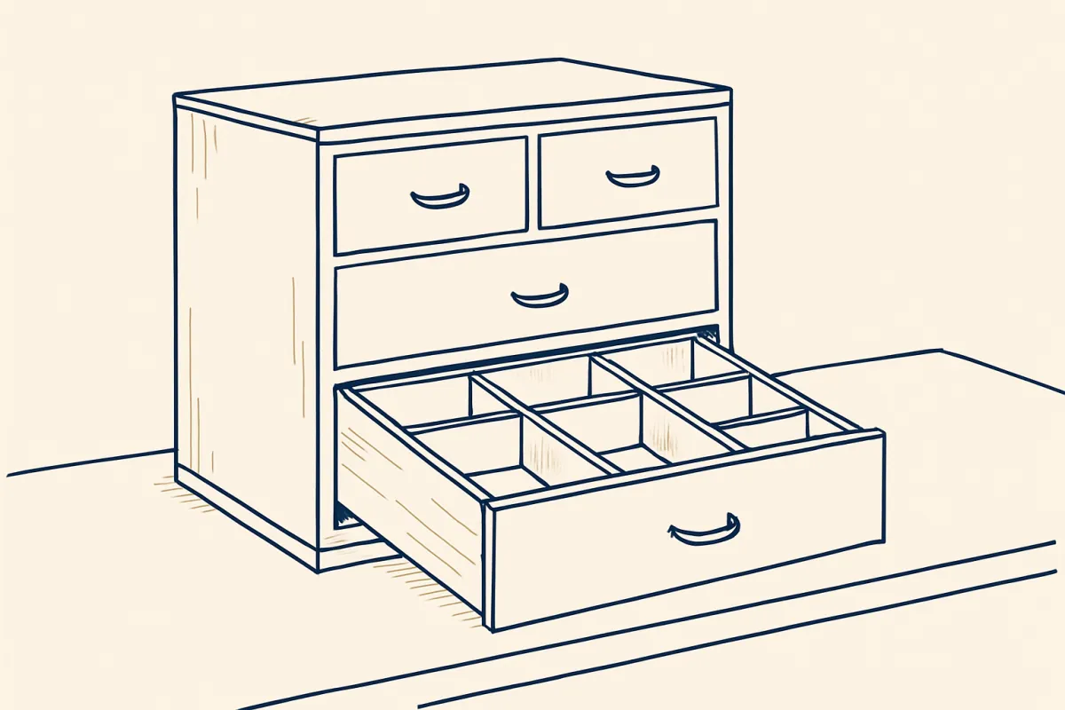
A dropdown is a small menu that opens when you hover over or tap a menu item. It is handy when you have several pages that belong together.
Say you sell clothes. Instead of putting "T-Shirts," "Jeans," "Jackets," and "Shoes" all in the top bar, you put one link called "Shop" and tuck the categories inside it. Cleaner top bar, same access.
A few tips for dropdowns:
- Only use them when you truly have related pages to group.
- Keep each dropdown short. Long lists are hard to scan.
- Avoid dropdowns inside dropdowns. Two layers deep is already pushing it.
If you find yourself needing three layers of menus, that is usually a sign your site has grown messy. Step back and simplify.
Order your menu by importance, left to right
People read the top of a page from left to right (in most languages). So the items on the left get noticed first. Put your most important pages there and less important ones toward the right.
Here is a common and reliable order:
- Home (far left, or your logo doubles as the home link)
- Your main offer (Shop, Services, or Portfolio)
- About
- Blog or extra pages
- Contact (far right, where people expect it)
Notice "Contact" sits at the end. That is a familiar spot, so people look there without being told. Familiar patterns make your site feel easy, even to first-time visitors.
Give the most important action a button
Sometimes you want one action to stand out from the rest of the menu. Maybe it is "Book Now," "Get a Quote," or "Shop Sale." Making that item look like a button (a colored box instead of plain text) draws the eye straight to it.
Use this for just one thing. If everything is a button, nothing stands out. Pick the single action that matters most to your business and let it shine.
Don't forget the mobile menu
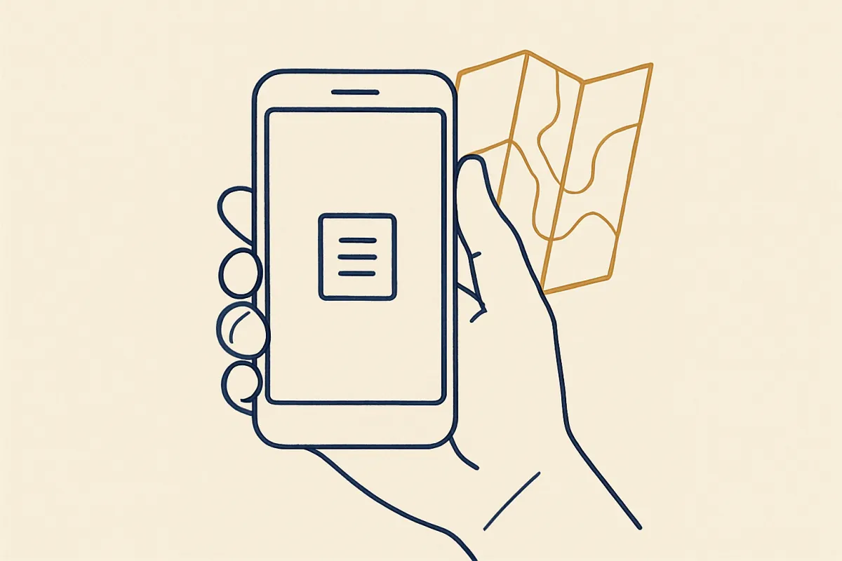
Most people will visit your site on a phone. On a small screen, your menu usually hides behind a little icon with three lines, often called a hamburger menu. When someone taps it, your menu slides open.
Test this yourself. Open your site on your phone and tap through every link. Ask:
- Do the links open the right pages?
- Is the text big enough to tap without zooming?
- Can you reach every important page in one or two taps?
A menu that looks great on a computer but breaks on a phone will cost you visitors. A fast, tidy site helps too, so it is worth checking a few simple ways to make your website load faster while you are at it.
Add a footer menu for the extra stuff
The footer is the strip at the bottom of every page. It is the perfect home for links people only need sometimes: your refund policy, shipping details, privacy policy, social media, and so on.
These pages matter, but they do not belong in your main menu where they crowd out the important links. Tucking them into the footer keeps the top clean while still giving people access when they look for it. Many visitors instinctively scroll down when they want fine print, so the footer is exactly where they expect to find it.
Make sure key pages are easy to reach
Two pages quietly do a lot of work: your about page and your contact page. People check the about page to decide if they trust you, and they use contact when they are ready to reach out. Both deserve a clear spot in your menu.
If you want these pages to really pull their weight, it helps to build them with care. Here is how to write an about page that builds trust and how to create a contact page that gets people to reach out. A great page is wasted if nobody can find it, so link to it and make it obvious.
Test your menu with a real person
Here is the easiest quality check there is. Ask a friend who has never seen your site to find something specific, like "Find out how much shipping costs" or "Find how to contact the shop." Then watch, quietly.
If they pause, look confused, or click the wrong thing, your menu is telling you something. Fix the labels or the order and try again. You will learn more from watching one real person than from staring at the menu alone for an hour.
Putting it all together
A good navigation menu is short, clearly labeled, and ordered by what matters most. It works on phones, uses the footer for extra pages, and points people straight to the actions you care about. None of this is complicated. It just takes a little planning and a willingness to keep things simple.
If you are building your site with a drag-and-drop tool like vq.pe, you can add, rename, and reorder menu items in a few clicks and preview the mobile version instantly, so trying these ideas takes minutes, not hours.
Start with your list of what visitors want, trim the menu to the essentials, and test it on one real person today. A clear path through your site is one of the kindest things you can offer a visitor, and it quietly turns more of them into customers.