How to Create a Contact Page That Gets People to Reach Out
Most contact pages quietly lose leads. Here's how to build one that feels friendly, easy, and safe enough that visitors actually message you.
Your contact page is often the last stop before someone becomes a customer. They liked what they saw, they're ready to ask a question, and then they land on a page that either makes it easy to reach out or quietly pushes them away. A good contact page removes doubt and invites the message. A bad one leaves people staring at a lonely form, unsure if anyone will even reply.
The good news? You don't need anything fancy. You just need to make reaching out feel simple, safe, and worth the effort. Here's how to do exactly that.

Why most contact pages fail
Think about the last time you almost messaged a business and didn't. Maybe the form asked for too much. Maybe you couldn't tell if it went to a real person. Maybe there was no phone number, no address, nothing that felt human. So you closed the tab.
That happens more than you'd think. People are cautious. Filling out a form feels like shouting into a void. Your job is to make it feel like knocking on a friendly door instead.
Three quiet problems kill most contact pages:
- Too much friction. Long forms with ten fields scare people off.
- No reassurance. Visitors don't know if you'll reply, or when.
- No personality. A cold page feels like a company that won't care.
Start with a warm, human intro
Before the form, add one or two short lines that sound like a real person. Skip the stiff "Please fill out the form below." Instead, say something like, "Got a question? We'd love to hear from you. Send a message and we'll usually reply within a day."
That small bit of warmth does a lot. It tells the visitor a human is on the other side. If you're not sure how to strike that tone across your site, our guide on how to write website copy that sounds human is a helpful starting point.
Keep the form short
Every extra field you ask for is a reason to give up. For most businesses, you only need three things:
- Name so you can reply personally.
- Email or phone so you can actually reach them back.
- Message so they can say what they need.
That's it. If you run a service business and need a little more, add one optional field, like "What are you interested in?" But resist the urge to ask for their company size, budget, and life story before they've even said hello. You can gather details later, in the reply.
A quick real-world example
Say you're a wedding photographer. A tempting form asks for the date, venue, guest count, and package. But a first-time visitor doesn't want to fill all that in. A short form that just says "Tell us about your day" gets far more messages. You ask the specifics once they've reached out and shown interest.
Give people more than one way to contact you
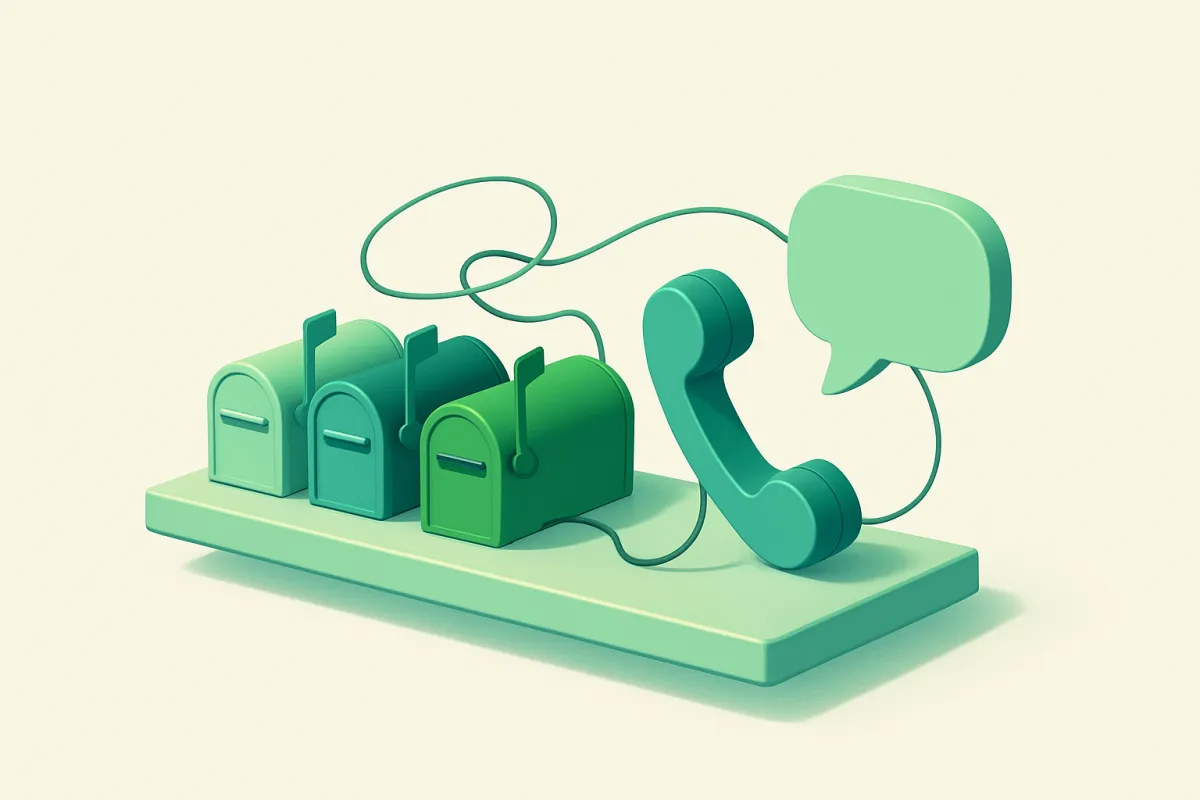
Not everyone likes forms. Some people want to call. Others prefer WhatsApp, email, or a quick message on social media. The more options you offer, the more likely someone picks the one they're comfortable with.
List them clearly:
- A clickable email address.
- A phone number people can tap to call on mobile.
- A messaging or chat link if you use one.
- Links to the social profiles you actually check.
One important tip: only list channels you truly watch. An unanswered email or a dead phone number does more harm than no listing at all. If you have a local shop, connecting your Google Business Profile also gives people an easy way to find directions and call you directly.
Set expectations so people feel safe
The biggest reason people hesitate is uncertainty. They don't know what happens after they hit send. So tell them.
Add a short line like, "We reply to every message within one business day." Even a simple promise removes the fear of shouting into the void. And after someone submits the form, show a friendly thank-you message: "Thanks! Your message is on its way. We'll get back to you soon."
That confirmation matters. Without it, people wonder if the form even worked, and some send the same message twice or give up entirely.
Add small touches of trust
A contact page is a moment of doubt, so anything that builds confidence helps. You don't need much. A few small signals go a long way:
- A real photo of you or your team, not a stock image.
- Your business hours, so people know when to expect a reply.
- Your physical address or service area, if you have one.
- A line pointing to happy customers, like "See what our clients say."
If you've gathered praise from past customers, linking out to reviews works well here too. Our post on how to collect and display customer reviews shows simple ways to do that. Trust built on your about page carries right through to the moment someone decides to message you.
Make it easy to find and easy to use
A great contact page is useless if no one can reach it. Put a clear link in your main menu and again in your footer, so it's available from every page. Don't hide it behind clever wording. "Contact" works better than something creative that people won't recognize.
Also check it on a phone. Most visitors will see your page on mobile, so the form fields should be big enough to tap, the phone number should be clickable, and nothing should require pinching or zooming. A page that's annoying to use on a small screen loses messages you'll never even know about.
Put it all together: a simple checklist
Here's a quick run-through to build or fix your contact page today:
- Write one or two warm intro lines that sound like a person.
- Keep the form to name, contact, and message.
- List two or three extra ways to reach you, and only ones you check.
- State your reply time clearly.
- Show a friendly thank-you message after someone submits.
- Add a photo, your hours, and a location or service area.
- Link it in your menu and footer.
- Test the whole thing on your phone, and send yourself a test message.
That last step catches more problems than anything else. Send a real message through your own form and confirm it lands in your inbox. Broken forms are shockingly common, and a broken one silently costs you every lead.
Where a website builder helps
You can build all of this by hand, but wiring up a working form, spam protection, and email delivery takes time and a bit of technical patience. A builder like vq.pe lets you drop in a contact form, connect it to your inbox, and add your details without touching any code, so the whole page can be live in an afternoon.
A contact page doesn't need to be clever. It needs to feel easy and human. Trim the form, warm up the words, tell people when you'll reply, and make sure it works. Do that, and the messages will start coming in. Open your contact page right now, read it as if you were a nervous first-time visitor, and fix the first thing that gives you pause.