How to Build a One-Page Website That Converts
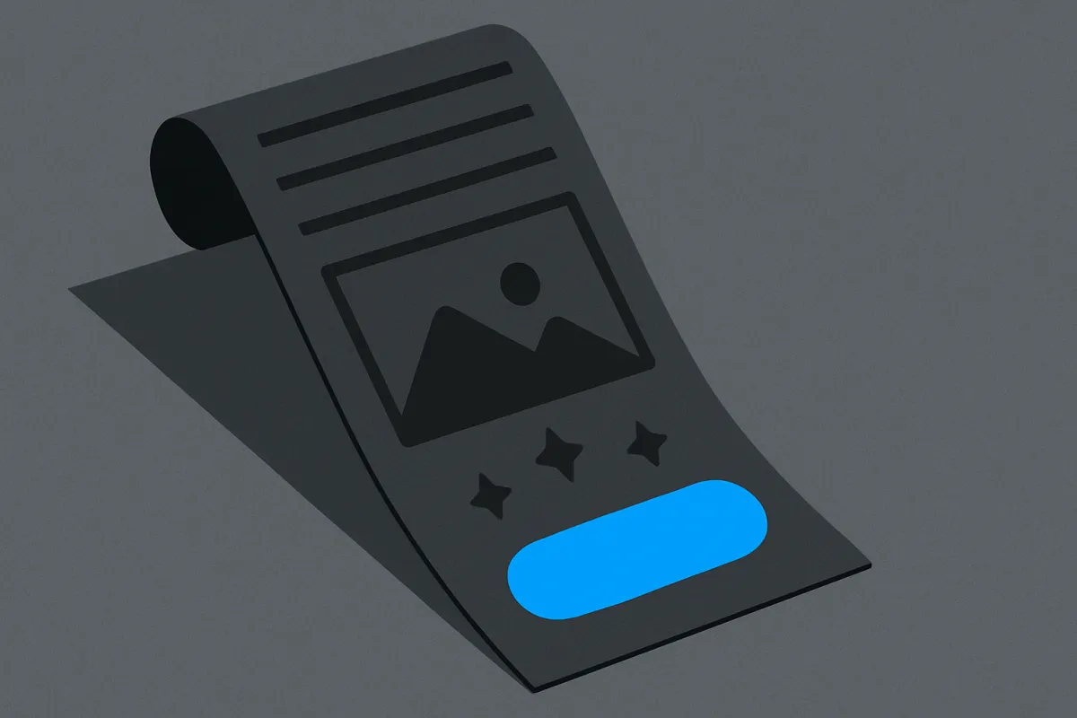
A one-page website is often all a solo business needs. Here's how to plan, write, and lay it out so visitors turn into paying customers.
You don't need a big website to run a real business. Most solo businesses do just fine with a single page that tells people what you offer and makes it easy to say yes. The trick is building a one-page website that converts, meaning it actually turns visitors into buyers or leads instead of just looking pretty. This guide shows you exactly how, step by step, in plain language.
Why one page is often enough
When someone lands on your site, they have three quiet questions: What is this? Is it for me? What do I do next? A single page answers all three without making people click around and get lost. Fewer pages means fewer places to leave.
A one-page site is also faster to build, faster to load, and easier to keep updated. For a freelancer, a small shop, a coach, or anyone selling one main thing, it's usually the smartest place to start. You can always add more pages later once you know what people actually want.
Plan the page before you build anything
Don't open a builder yet. Grab a piece of paper first. A page that converts follows a natural order, like a good conversation. You greet the person, explain how you help, prove you can be trusted, and then ask them to act.
Here's a simple order that works for almost any solo business:
- Headline: one clear line that says what you do and who it's for.
- Short intro: a sentence or two on the problem you solve.
- What you offer: your product, service, or main packages.
- Proof: reviews, results, logos, or before-and-after examples.
- About you: a short, human note on who's behind it.
- The action: a button to buy, book, or get in touch.
- Answers: a few common questions so nobody hesitates.
Notice the order. Trust comes before the ask. People rarely buy from a stranger, so you earn a little belief first, then invite them to act.
Write a headline people instantly understand
Your headline is the most important line on the whole page. If a visitor reads it and feels confused, they leave. So skip clever wordplay and be clear instead.
A strong headline usually names who you help and what result they get. For example, "Handmade birthday cakes, delivered across the city in 24 hours" beats "Baking dreams into reality." One tells you exactly what's on offer. The other tells you nothing.
Read your headline out loud. If a friend would understand it in two seconds, you're good. If they'd ask "wait, what do you actually sell?", rewrite it. When you're stuck on wording, our guide on how to write website copy that sounds human and sells walks through this in more detail.
Show what you offer clearly
After the headline, tell people what they get. Keep it simple. If you sell products, show a few with clear photos and short descriptions. If you sell a service, list your main packages with what each includes.
Use short chunks, not big walls of text. People scan before they read. Break things into small blocks with a mini heading for each. And skip the fluff, every word should either explain, prove, or push gently toward action.
If you have several products or services, don't cram all of them in. Pick your best sellers or your clearest offer. Too many choices can freeze people. One or two strong options usually beat ten confusing ones.

Add proof so people believe you
This is the part most beginners skip, and it's the part that quietly wins sales. People trust other people more than they trust you. So show them.
- Real customer reviews, with a first name and a photo if you can.
- Numbers you're proud of, like "served 300 happy clients" (only if true).
- Before-and-after photos, sample work, or a short case story.
- Logos of places you've worked with or been featured in.
Even two or three honest reviews make a difference. If you're just starting and have none yet, ask your first few customers for a short line of feedback. It's worth the ask. For a full walkthrough, see how to collect and display customer reviews that win buyers.

Make the action obvious and easy
Every converting page has one clear thing it wants you to do. Buy the product. Book a call. Send a message. Join a list. Decide on that one action before you build, and make it stand out.
Use a button, not just a line of text. Give it plain words that say what happens next, like "Book your free call" or "Order now." Repeat the button a few times down the page, so people can act the moment they feel ready, without scrolling back up to hunt for it.
If your goal is a message rather than a sale, don't bury your details. A clean, friendly form works far better than a wall of contact info. Our guide on building a contact page that gets people to reach out shows how to keep it simple and inviting.
Keep checkout painless
If you're selling, the moment someone taps "buy" should feel effortless. A long form or a confusing payment step loses sales you already earned. Let people pay the way they prefer, whether that's a card, a wallet, or cash on delivery, and keep the number of steps small. Payment options and rules vary by country, so check what's normal where your customers live.
Answer the questions holding people back
Before anyone buys, they have small worries. How long does delivery take? What if I don't like it? Is this really for beginners? A short set of answers near the bottom of the page removes those doubts quietly.
Write down the questions you get asked most and answer them plainly. This also saves you time, because you'll get fewer "quick question" messages. Keep answers to two or three sentences each.
Build it fast without the tech headache
You don't need to code any of this. A drag-and-drop builder like vq.pe lets you lay out each section, add a buy button or contact form, connect payments, and go live from one place. That keeps your store, checkout, and page together so buyers move from interest to purchase without leaving your site.
Here's a quick order of work so you don't stall:
- Write your headline and rough text in a notes app first.
- Gather your photos and any reviews you have.
- Drop each section into your builder, top to bottom.
- Add your main button in two or three spots.
- Test it on your phone, since most people will view it there.
- Publish, then share the link with a few friends for feedback.
Keep it clean and mobile-friendly
Most of your visitors will be on a phone. So check the page on a small screen before you celebrate. Text should be easy to read, buttons big enough to tap, and photos quick to load. If you have to pinch and zoom, so will everyone else.
Give your content room to breathe. Empty space isn't wasted space, it helps people focus. A calm, uncluttered page feels more trustworthy than a busy one stuffed with everything at once.
Test, then improve slowly
Your first version won't be perfect, and that's fine. Publish it anyway. A live page teaches you more than endless tweaking. Watch what happens. Are people clicking the button? Are they leaving fast? Small changes to your headline or your main offer often make the biggest difference.
Once your one page is pulling in visitors, your next job is turning that traffic into steady customers. If you want a plan for that, read how to get your first 100 customers for a new online business.
You don't need a giant site or fancy design skills. You need one clear page that says what you do, proves you can do it, and makes the next step easy. Sketch your sections today, write your headline, and put it live. Your first customer is waiting on the other side of that button.