
How to Design a 404 Error Page That Keeps Visitors
A blank 404 page sends visitors away. Learn how to design a helpful 404 error page that keeps people on your site and guides them back on track.
A visitor clicks a link, expects a page, and gets nothing. Just a cold message that says the page was not found. Most people leave right there. But a good 404 error page can catch that visitor, calm them down, and gently point them somewhere useful. This guide shows you how to build one that keeps people on your site instead of losing them.
What a 404 page actually is
A 404 page is what shows up when someone tries to visit a page that does not exist on your site. Maybe they typed the address wrong. Maybe you deleted an old page. Maybe another website linked to you with a broken link. The result is the same: a dead end.
The name comes from a simple code your website sends behind the scenes. You do not need to understand the code. You just need to understand this: by default, a 404 page is boring and unhelpful. And that is a wasted chance to help someone.
Why a good 404 page matters
Think about a real person landing on a broken page. They wanted something. Now they feel stuck. If the page is blank or confusing, they hit the back button and go somewhere else, maybe to a competitor.
A helpful 404 page does the opposite. It says, in a friendly way, "Oops, that page is gone, but here is where you can go instead." That small moment of care keeps people browsing. For an online store, that can be the difference between a lost visitor and a sale.
- It reduces the number of people who leave right away.
- It keeps visitors moving toward pages that matter, like your shop or homepage.
- It makes your brand feel human and cared-for, even when something breaks.
What every good 404 page needs
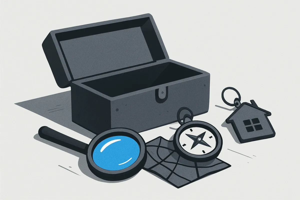
You do not need anything fancy. You need a few simple parts that work together. Here is the checklist.
- A clear, friendly message. Tell people the page is missing in plain words. Skip the technical talk. Something warm like "Sorry, we can't find that page" works fine.
- A link back to your homepage. This is the most important link. Make it big and easy to spot. It gives every lost visitor one obvious next step.
- A search bar. If someone came looking for a product or article, let them search for it right there instead of wandering off.
- Links to your best pages. Add three or four buttons or links to your most popular sections, like your shop, your top products, or your contact page.
- Your menu. Keep your normal site menu visible so people can navigate as they would anywhere else.
- A touch of personality. A small friendly image or a light joke makes the moment feel less like a failure and more like a small bump.
How to design it step by step
Let's build the page in order. Follow these steps and you will have a solid 404 page.
1. Write a short, kind message
Start with one line that admits the problem in plain language. Then add one line that reassures. For example: "That page seems to have moved or no longer exists. Let's get you back on track." Short and human beats clever and confusing.
2. Add one strong main button
Give people a single, obvious action. Usually that is "Go to homepage" or "Back to shop." Make this button large and easy to tap on a phone. When someone feels lost, one clear button is a relief.
3. Include a search bar
Many visitors on a 404 page were hunting for something specific. A search box lets them find it fast. This matters even more for stores with lots of products. If you want help with this, our guide on how to build a store search bar that helps shoppers find products fast walks you through it.
4. Offer a few helpful links
Below the main button, add a short list of popular destinations. For a store, that might be "Best sellers," "New arrivals," and "Contact us." For a portfolio, it might be "See my work" and "Hire me." Keep it to three or four so it does not feel crowded.
5. Keep your usual header and menu
Your normal navigation should stay on the page. A 404 page should still feel like part of your site, not a separate broken screen. When your menu is there, people can move around like normal.
6. Add a friendly image
A simple, warm illustration softens the moment. It does not need to be complicated. A little drawing or a photo that matches your brand is enough to make the page feel welcoming instead of cold.
A quick before and after
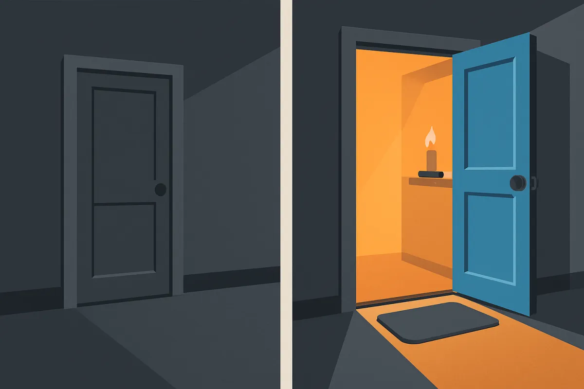
Imagine a small shop that sells handmade candles. Someone clicks an old link from a newsletter, and the product is gone.
Before: A plain white page with the words "Page not found." The visitor sighs and closes the tab. Sale lost.
After: A friendly page that says "This candle sold out and moved on, but we have plenty more." Below it, a button to the full shop, a search bar, and links to the three best-selling scents. The visitor clicks "Best sellers," finds something they like, and buys it. Same broken link, very different ending.
Common mistakes to avoid
A few small errors can undo all your effort. Watch out for these.
- Leaving it blank. The default page from your tools is almost always bare. Always customize it.
- Automatic redirects with no explanation. Some sites bounce people straight to the homepage. That can be confusing because visitors do not know what happened. A short message first is kinder.
- Too many choices. If you list twenty links, people freeze. Pick a few strong options.
- Being funny but not helpful. A joke is nice, but never skip the actual links. Personality plus a clear path is the goal.
- Forgetting mobile. Most visitors are on phones. Make sure the button and search bar are big and easy to tap.
Turn the 404 page into a chance to sell
Since the visitor is already there, you can gently offer something. A store might show its top products or a current sale. A creator might invite people to browse their portfolio or subscribe. The key word is gentle. You are helping first, offering second.
This is a good moment to point people toward pages you have worked hard on, like a well-built product category page that sells faster. And while you are fixing broken paths, it helps to strengthen the healthy ones too. Our guide on how to add internal links to your website shows how good linking keeps visitors moving and helps your search ranking at the same time.
Make it easy on yourself
You do not need to code any of this. Most modern website builders let you edit your 404 page like any other page, using drag and drop. On a platform like vq.pe, you can design a custom 404 page with your menu, a search bar, buttons, and images, so a broken link still leads somewhere useful.
Once your page is live, test it. Type a fake address into your own site, like your web address followed by a made-up word, and see what shows up. Check it on your phone too. If the page feels friendly and gives you a clear next step, you have done the job.
A broken link does not have to mean a lost visitor. With a warm message, one clear button, a search bar, and a few good links, your 404 page becomes a helpful signpost instead of a dead end. Take ten minutes today, open your site's 404 page, and give lost visitors an easy way back.